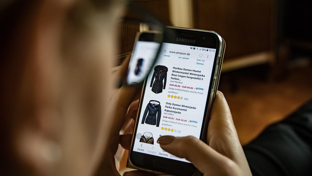


Many eCommerce brands operate under the costly misconception that all traffic is good traffic, pouring budget into acquisition while overlooking the fatal flaw on the destination page. You might celebrate hitting a new visitor milestone, but the sobering reality is that your store has, on average, just five seconds to guide that visitor to their first product page before they bounce. Every confusing category label, every non-intuitive drop-down menu, and every dead-end link is a high-friction point in the checkout funnel, transforming your paid media and SEO spend into an immediate, unnecessary revenue leak.
This inaction—allowing confusing navigation to deter high-intent customers—is the silent tax on your Customer Lifetime Value (LTV). Effective, clear navigation is not just a UI/UX nicety; it is the fundamental, non-negotiable bedrock of conversion rate optimization and revenue expansion. By engineering a logical and effortless customer journey, you immediately maximize the return on your marketing investment and ensure that every visitor has a clear, frictionless path to purchase, turning potential bounces into profitable, loyal customers.
Maximize Checkout Velocity: The Direct Link Between Navigation and Revenue
Navigation is not merely a site map; it is the conversion funnel’s high-speed rail. Every click a customer makes to get from the initial entry point to the final ‘Place Order’ button represents a potential drop-off. Checkout Velocity—the speed and ease with which a customer moves through the purchase flow—is directly proportional to the clarity and efficiency of the preceding navigation. Ambiguous labels, cluttered mega-menus, or poorly optimized category filters force cognitive load and introduce friction, slowing the path to purchase and directly increasing bounce rate and cart abandonment. A core technical best practice is to design navigation that anticipates the customer’s intent and provides clear, unambiguous paths for the highest-intent segments of your audience.
- Shallow Hierarchy: Reduce the number of clicks required to reach any key product page to a maximum of three. This minimizes the chance of user fatigue and reduces the mental distance to conversion.
- Categorical Integrity: Ensure all top-level navigation labels are high-signal and distinct. Utilizing specific product types instead of vague terms like “Shop” or “Products” drastically improves user confidence in their path and reduces misclicks.
- Dedicated Conversion Anchor: The Cart/Checkout icon must be persistently visible and visually distinct across all pages, serving as a constant, high-priority destination anchor for customers ready to convert.
Implementing these principles transforms a static menu into a dynamic, revenue-driving asset. By minimizing the “time-to-find” and reducing decisional friction, you not only increase the immediate likelihood of a conversion but also improve Customer Lifetime Value (LTV) by creating a streamlined, positive user experience that encourages repeat visitation. Analytical review of navigational click-through rates and exit rates by category is essential for continuous A/B testing and funnel optimization, ensuring the navigation structure always serves the goal of maximizing revenue.

Stop Leaking Leads: Using Intuitive Navigation to Boost Email Capture
The single greatest drain on a high-growth WooCommerce store is the missed opportunity of the “cold” visitor who leaves before being converted into a lead. Intuitive navigation serves as the foundational technical mechanism to prevent this leak. When a user finds the specific product category or information they need immediately, their cognitive load drops, increasing their willingness to engage further. This extended engagement—gained purely from navigational clarity—is the critical window of opportunity to present a contextual, high-converting email capture mechanism before a bounce occurs.
To leverage your navigation system for maximum lead capture efficiency, focus on these implementation points:
- Contextual Opt-In Placement: Optimize email sign-up forms to appear on high-traffic, mid-funnel pages (like Category or Collection views) that are accessed directly from the primary navigation. The opt-in incentive should be hyper-relevant to that specific category, for example, offering a “Pet Care Guide” on the dog food collection page instead of a generic site-wide pop-up.
- Mega Menu High-Intent Paths: For stores utilizing mega-menus, embed a soft conversion element directly into the menu structure. This might be a clear, visually distinct link to a “Loyalty Program,” “VIP Access,” or a link to a resource hub that requires an email to download, capitalizing on the high-intent exploration stage.
- Optimized Footer Navigation for Trust: A customer is far more likely to provide their email if they trust your brand. Ensure your footer navigation features clear links to non-product pages critical for trust, such as “Shipping Policy,” “Returns,” and “About Us.” The presence of these transparent links reduces friction and builds confidence, which is a direct precursor to lead conversion.
By structurally integrating your email capture strategy with your navigation, you transition from a passive lead collection model to an active, intent-driven one. This ensures that the leads you do capture are already pre-segmented based on their specific navigational journey, dramatically increasing the relevance and conversion rate of your subsequent email marketing flows and contributing directly to long-term Customer Lifetime Value.
Automating User Flow: How Clear Site Structure Reduces Customer Support Load
The operational cost of a poorly structured site is directly measurable in your customer support metrics. Ambiguous or convoluted navigation transforms your support inbox into a secondary, unscalable search engine. When a customer cannot locate product specifics, policy details, or their order status within the logical flow of your WooCommerce store, the default action is to open a ticket or initiate a chat. This process of using a human agent to answer an automated question is a critical failure of user flow automation and creates significant, unnecessary operational debt for a scaling business.
The technical strategy to combat this involves strategically placing links to high-support-volume information in non-negotiable, contextually relevant locations. This preemptive design drastically reduces the volume of repetitive inquiries that consume valuable team resources.
- Shipping Information Visibility: A clear, universal link in both the header and footer, as well as an accessible anchor on all Product Detail Pages (PDPs). This directly targets and minimizes tickets related to shipping costs, transit times, and delivery FAQs.
- Policy Hub Integration: Prominently linking Returns, Exchanges, and Warranty policies within the universal footer and contextual pop-ups near the ‘Add to Cart’ button. This proactively addresses pre-purchase friction and post-purchase procedure questions.
- Product-Specific Guidance: Integrating dynamic content like Size/Fit Guides or Compatibility Charts directly adjacent to the product selection interface on the PDP. This eliminates the most common reason for product-related pre-purchase support inquiries and reduces return rates caused by sizing errors.
By effectively automating the informational flow through superior site architecture, your support function is liberated from transactional, repetitive tasks. This allows your team to shift focus to high-leverage issues—technical platform bugs, complex order disputes, and VIP customer relations—thereby transforming customer support from a cost center struggling with volume into a focused retention and recovery engine.
From Click to Repeat: Future-Proofing LTV with a Seamless Customer Journey
A seamless customer journey is the foundational element for maximizing Customer Lifetime Value (LTV), and that journey begins and ends with intuitive navigation. When a customer can effortlessly transition from product discovery to a completed purchase, the cognitive load—the mental effort required to use the site—is minimized. This reduction in friction is the core of a positive user experience (UX) that encourages not just the first sale, but the habitual, repeat purchases that define high LTV. Navigation should function as a highly efficient internal GPS, reinforcing a feeling of familiarity and control that makes your WooCommerce store the preferred destination over any competitor.
- Hierarchical Clarity: Ensure the primary navigation reflects clear, common-sense user mental models, not your internal warehousing or merchandising structure. This direct path is crucial for users who bookmark your site or return directly to high-intent category pages.
- Contextual Filters and Search: Implement a robust, faceted search and category filtering system that anticipates user intent. This means allowing immediate filtering by critical attributes like size, color, or price range from the main category page, reducing the number of clicks required to isolate a desired product.
- Post-Purchase UX Mapping: True LTV is built after the first sale. Ensure ‘My Account’ or the user hub prominently features immediate links to ‘Order History,’ ‘Easy Reorder,’ and ‘Loyalty Status.’ This navigates the customer back into the purchase loop with zero friction.
Architecting your navigation for clarity also provides a critical, unseen technical advantage by delivering superior data fidelity for your retention marketing efforts. When user paths are direct and predictable, the behavioral data collected is cleaner, unpolluted by excessive clicks or high bounce rates due to confusion. This precise data enables advanced customer segmentation. By isolating users based on the specific, clear categories they browse, you can deploy highly personalized, timely email and SMS flows—transforming generic promotional messaging into a targeted value-add, which is the key mechanism for scaling LTV in a sophisticated eCommerce ecosystem.
Eliminating Purchase Friction: Why Navigation is a Technical SEO Conversion Factor
Effective navigation is a critical technical SEO factor that directly dictates how search engine crawlers understand your site’s hierarchy. A shallow, well-structured category system embedded within the main navigation signals to bots where your most important link equity should flow. Conversely, burying product pages or key categories more than three clicks deep not only introduces unnecessary friction for a converting customer but also signals low importance to the crawler, which can negatively impact the page’s ability to rank and be frequently indexed. This architectural efficiency is paramount to managing crawl budget and ensuring deep-funnel pages are discoverable.
The elimination of purchase friction is intrinsically linked to the speed and technical cleanliness of your navigation. Excessive JavaScript, complex animations, or slow-loading mega menus often compromise Core Web Vitals scores like Interaction to Next Paint (INP). This negatively affects user experience, increases bounce rate, and simultaneously undermines your SEO performance. Prioritize a fast, accessible, and structured framework. To ensure your navigation is technically optimized for both crawlability and conversion, focus on these elements:
- HTML Link Rendering: All critical navigational links must be rendered via standard tags in the initial HTML document load, minimizing reliance on client-side JavaScript injection for bot discoverability.
- Mobile Link Equity: The mobile navigation structure must fully replicate the desktop link architecture. Any links hidden from the crawler in the mobile view will result in lost internal link equity and a suboptimal Core Web Vitals score.
- Canonical URL Consistency: Verify that every link in the navigation consistently points to the preferred canonical URL for that page to prevent the distribution of internal link equity across different URL variations.
Ready to take your e-commerce to the next level?
The clarity of your site navigation is not a simple design choice; it is a critical gatekeeper for profitability. If you’ve optimized your menu but your conversion rate is still flatlining, the core problem is a systemic revenue leak stemming from a fragmented customer experience. Relying on basic bounce rate metrics is a critical oversight; the sober truth for high-growth WooCommerce brands is that structural friction—whether in the checkout flow, abandoned cart sequence, or CRM integration—is actively deterring high-value segments and suppressing your true Customer Lifetime Value (LTV).
To move beyond isolated, tactical fixes and build a truly profitable, end-to-end eCommerce system, you need a strategic partner focused on the entire conversion funnel. We act as an extension of your in-house team, helping DTC/eCommerce brands radically increase Profit, Retention, and LTV. Our process begins with rigorous, no-guesswork, data-driven & conversion-focused audits to pinpoint the exact structural leaks in your current system—ensuring your tracking, CRM, and customer journey are all operating in concert to maximize Return On Ad Spend (ROAS). If you are ready to pivot from temporary fixes to long-term, scalable growth, book a free consultation today.